
CASE STUDY

PROJECT OVERVIEW
Client: Conceptual project
Duration: 3 weeks sprint
Team: Arielle Tannin, Alejandra Olmedo
Role: UX Research, UX Designer
Design Deliverables: Interviews, Affinity Maps, Data Synthesis, User Flows, Sketches, Wireframes, Prototyping, Usability Test, Next Steps
Tools: Figma, FigJam, Notion
TABLE OF CONTENT

The Brand
The Challenge
Competitive & Comparative Analysis
User Interviews

Our Persona
Problem Statement
How Might We?
User Flow

Sketches & Wireframes
Usability Tests
Design Inspiration
Design System

Final Prototype
Next Steps
THE BRAND
Moleskine is a renowned brand known for its high-quality notebooks, journals, and other stationery products.
Moleskine Smart Notebooks are part of the Moleskine + Collection, blending naturally analog elements with smart technology to empower creativity and help you capture, develop and share your ideas.
THE CHALLENGE

Moleskine wants to explore the possibility of adding a killer new feature to their smart notebook line - social networking. Honoring the brand’s heritage of literary and visual creativity, how could a custom social networking experience enhance the needs of Moleskine owners who might want to share - publicly or anonymously - their work?
What aspects of the ways Moleskine is used today - journaling, sketching, creative note-taking - could be made even better or more fulfilling?

WHERE TO BEGIN?


How would a social networking app fit with Molenskine’s vision and brand?


What kind of user would find a social networking app for Moleskine useful?


How can we help our user accomplish her goals?
RESEARCH PHASE
RESEARCH OBJECTIVES
Before delving into our research with creative hobbyists who frequently utilize platforms to share and seek inspiration, we established our research objectives. This was essential for providing a clear starting point, guiding the formulation of questions that would yield the insights we were seeking.

Learn about how creatives find inspiration for projects.

Understand how creatives feel about sharing their work and receiving feedback it.

Identify gaps and pain points with today’s social platforms for creative work.
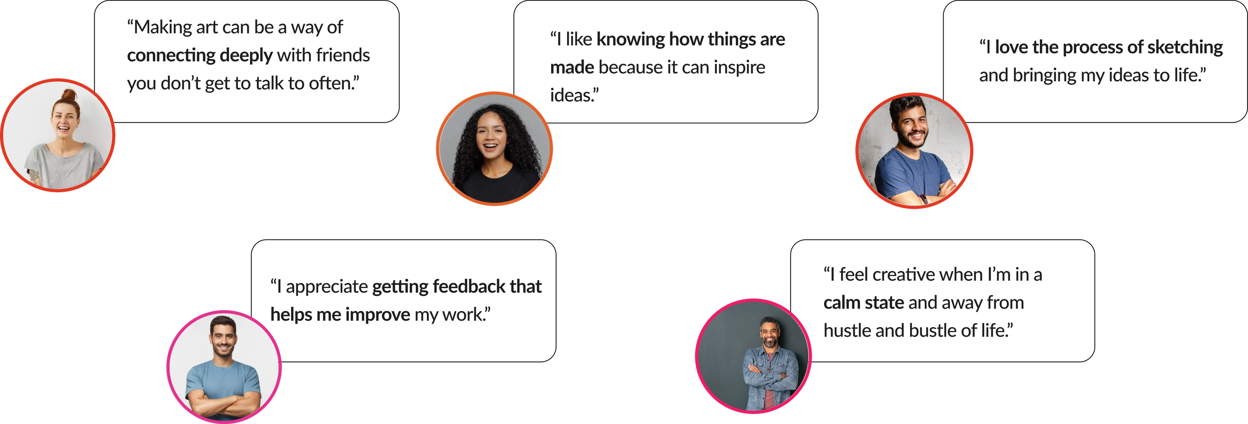
INTERVIEWS SYNTHESIS
x5
After interviewing 5 users, we delved into creating an affinity map to assist us in identifying trends and categorizing all the insights we gathered. We translated these trends into "I" statements, and the following are a few affinities that will guide us in shaping our persona.

PERSONA
Now equipped with a clearly outlined persona that captures specific behaviors and evident needs, we now have a clearer insight into the group we're strategically designing for. This in-depth understanding improves our capacity to fine-tune our efforts and align our initiatives with the exact needs of our target audience.

Meet Katherine, the community seeking creative
“When I make something, I really want it to be seen and enjoyed by others.”

COMPETITIVE & COMPARATIVE ANALYSIS
POSITIVES
Visually appealing discovery feeds
Advanced editing features
Intuitive filtering

NEGATIVES
Limited ways to engage beyond generic likes and comments
Focus on accumulating “likes”
Overwhelming quantity of content

PLUSES & DELTAS
Who are our competitors and what do they excel on and whats their downfall? It was important to move forward asking ourself this question, not to create something similar, but something better that surpasses the expectations of our users interacting with this brands. And the following is what we found.

problem statement and how might we?
Now, let's embark on the development of a comprehensive problem statement. This statement will play a pivotal role as a strategic guide and blueprint for our forthcoming activities. Its primary purpose is to concentrate our efforts on designing solutions that cater specifically to Katherine's needs, ensuring a targeted and effective design process.
Katherine needs a way to share her work and receive meaningful feedback because feeling part of a community inspires her to complete her projects and grow as an artist.
HMW encourage creatives to provide meaningful feedback for each other?


sketches
We delved into my favorite part: Sketching!
Here, you can see the initial sketches, considering the pages our users will interact with during their experience. To accomplish this, we conducted three iterations in a design studio with a total of 3 participants.

lo-fi iterations
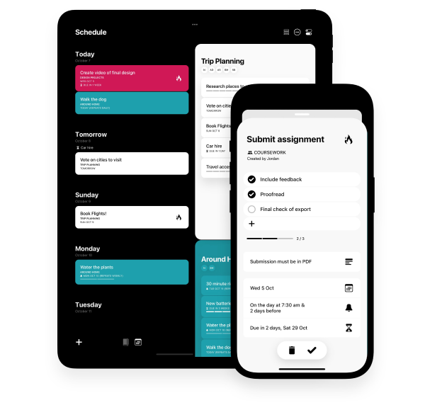
Now that we have established our core mid-fidelity wireframes, we promptly prototyped them to engage our users and determine the most effective design strategy moving forward.
Below is a more detailed explanation of our flow and the purpose of each page.
Home page
User entry point: From here, users can explore additional artist content across various categories, including curated content and content from artists they follow.

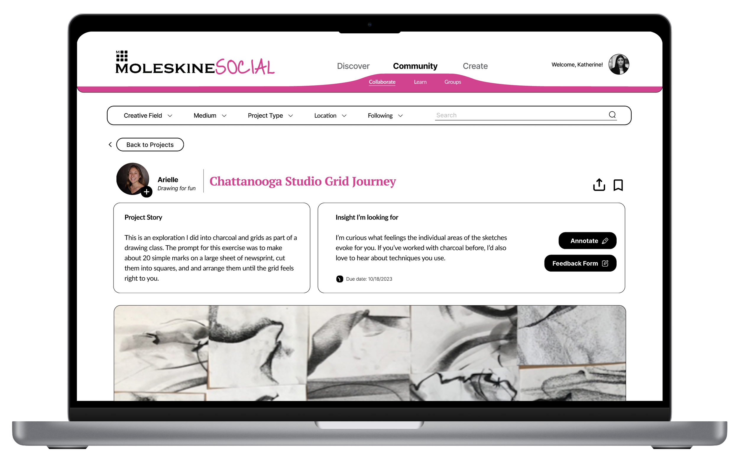
Community page - Projects
From the main navigation, users can navigate to the community page, where they can explore projects uploaded by other users with the intention of soliciting feedback of their choice.
In the project overview, users can view details such as the artist, project, and the specific input needed before entering the project page.

Project page
Upon entering the project page, users can peruse the entire project gallery and delve into more details about the project. They can focus on what specific feedback is needed before deciding to proceed further by either clicking "Annotate" or "Leave Input." Alternatively, users have the option to leave a general comment if they choose not to provide more detailed feedback.

Project page - Annotate mode
When entering Annotate mode (by clicking the pencil icon on the right), users have several options for providing feedback. They can draw directly on the images, pin comments to specific locations on the images, and attach contributions to specific points on the artwork.
For those who prefer written feedback, clicking "Leave Input" allows users to respond to questions posed by the artist.
After testing our prototype, users identified certain points of confusion. Below, you can see the specific areas where confusion arose and the corresponding solutions we implemented.
It was clear to me what the purpose of the website was.
USABILITY TESTS
QUANTITATIVE DATA
In this usability test, we assessed three users. Following the test, each participant received a survey, allowing me to collect the subsequent quantitative data.
QUALITATIVE DATA

I thought actions I could take on each page were intuitive and easy to understand

I would imagine that most people would learn to use thus system very quickly
USABILITY TESTS
problem
problem

I found the site easy to navigate

I found the website confusing

If I worked on a lot of creative, I think this system would be useful for me


solution

solution

visual design - ADDING FIDELITY
DESIGN INSPIRATION
Moleskine encompasses several platforms under its umbrella. This afforded us the opportunity to draw inspiration from them, aiming to maintain consistency and create a design that could be easily recognized and seamlessly adapted to their existing style guide. Our objective was to introduce something fresh and innovative while aligning with their established visual identity.
STYLE GUIDE
After gathering all our inspiration, we established a gallery consisting of the design elements showcased here. This provided us with the foundation to embark on the next phase: the creation of the final prototype.

App Icon


LOGOS


ICONS GALLERY


COLOR PALLETE

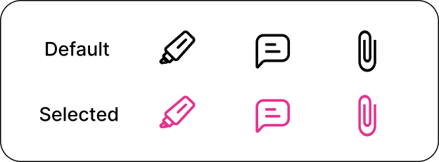
ICONS STATE
CALL TO ACTION BUTTONS

TYPOGRAPHY


DELIVERING OUR FINAL PROTOTYPE

Remote Usability Testing
Use unmoderated testing to uncover opportunities to improve flow
New Features
Create and join groups based on location
Discover and save projects
Customize your profile
View summaries & highlights of your feedback
New User Groups
Conduct research with different user groups to develop new features