Case Study
Barks N’ Rec
Research
User Interviews
Research synthesis
Heuristic Analysis
Cart Sort
Usability Test
Journey Map
Persona
Problem Statement
HMW’s
User Flow
Site Map
Sketch
Wireframes
Prototype
Usability Test
Prototype
Bark N’ Rec is an online pet shop situated in the Chicago area, specializing in a diverse range of supplies, including food and apparel.
First things first: What are our objectives? To formulate our interview guide effectively, it is crucial to establish the parameters around which our search should revolve. Consequently, I've developed a detailed guide that will serve as both a framework and a starting point for what lies ahead.
For this project, we conducted interviews with a total of four users. Considering the primary objectives of this research, my aim was to pinpoint the pain points within the industry and identify areas where we could introduce opportunities to enhance the overall user experience.
Let's kick things off by evaluating the current website!
Take a look at the following graphics to identify the primary pain points, though they are not limited to these.
Below, I'll outline the specific criteria where the current website falls short:
As I embark on analyzing the current website, it's crucial to delve into a study of the direct competition to comprehend what they offer that Bark N’ Rec currently does not. Staying attuned to the market's expectations is important in this rapidly evolving industry to ensure ongoing relevance.
It's essential to note that in the context of Bark N’ Rec, a green paw signifies inclusion, but it doesn't necessarily indicate exemplary execution. Hence, there's still room for improvement and opportunity for enhancement.
It was evident that the main navigation required significant attention. As illustrated on the right, there's a need for substantial information architecture. My objective was to streamline this process by reducing it by half, all while ensuring users could easily navigate their searches directly from the main page without nesting information.
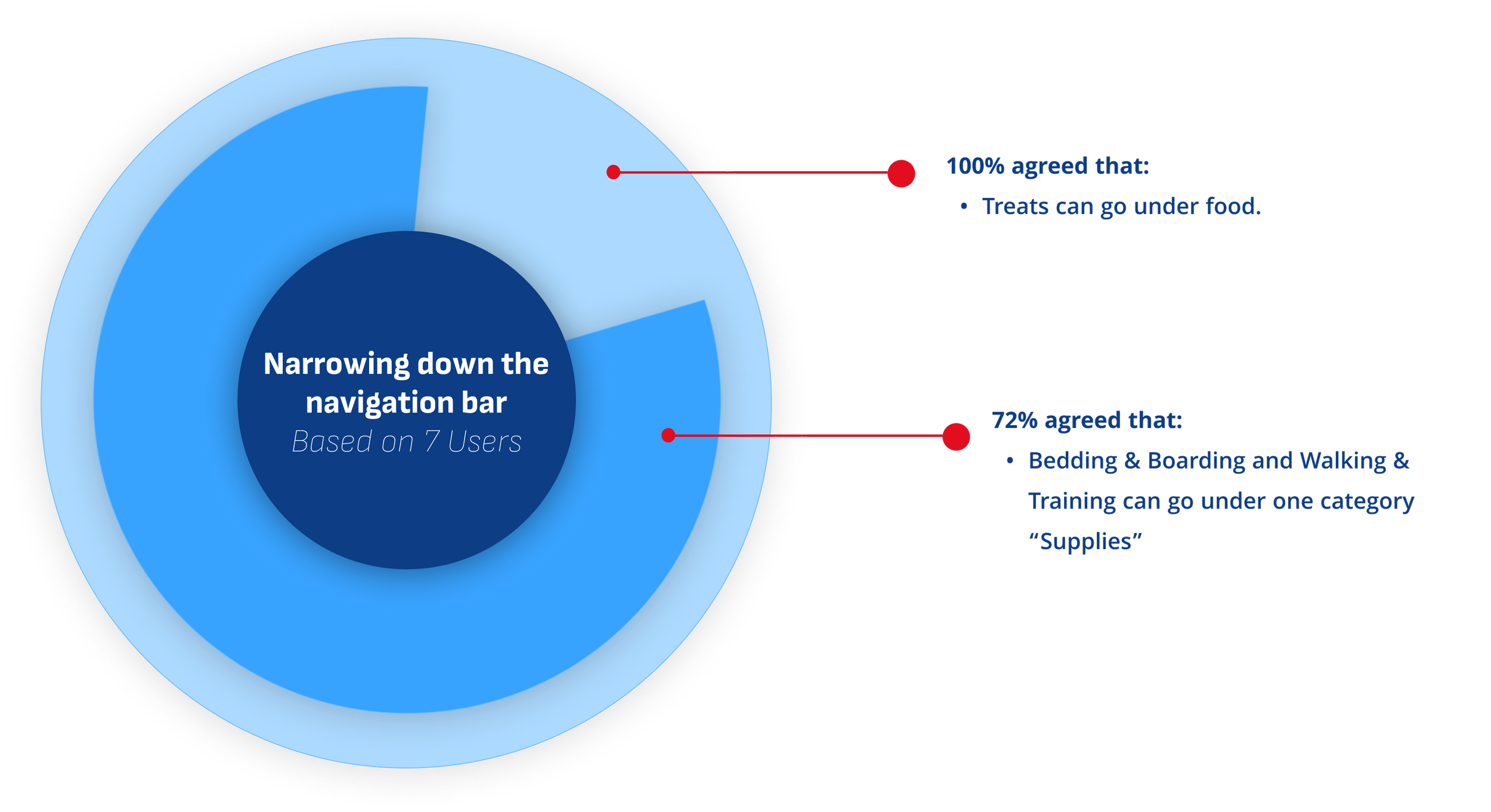
To achieve this, I conducted a Hybrid Card Sort, allowing users the freedom to both select and create categories where they saw fit. The results of this approach speak for themselves.
Platform used: OptiomalSort
Main Navigation Bar
I recognized that observing real-time user interactions with specific tasks would offer me a clearer understanding of the effectiveness of the current website. It would also shed light on how users react and navigate through the challenges I identified in my previous research analysis. The results were conclusive, highlighting that users encountered difficulties with all three basic tasks, as outlined below the graphics on the right.
Considering all of this, I realized from the outset that I needed to address the most frequent and crucial flow—searching, discovering, and payment—before delving into more complex tasks.
To gain a clearer understanding of our user journey and pinpoint the challenges they face at various stages throughout their experience, I created a Journey Map. This would allow me to visualize the relationship between their actions and their thoughts and feelings, and as a result this provide me with the opportunities inherent in each particular stage. This approach allowed me to design with consideration for all the opportunities, ensuring a comprehensive and cohesive approach from start to finish.
Concluding our research phase, we enter the Define Phase, starting with the creation of our Persona.
Building our persona is essential as it concentrates the focus of our designs by incorporating clear information about the needs, behaviors, and frustrations experienced by our main user, Tom. Developing this persona is crucial, synthesizing and condensing the research findings into a comprehensive and concise representation of our target user.
We have a problem, great!
Without a clearly defined problem, the ideation process becomes challenging, or not even possible. Having a well-articulated problem statement, accompanied by the rationale behind it, significantly simplifies the path to designing solutions.
The one, if not most important question 'How Might We?” approach solving this problem. This process serves as key to discover how to not only meet user needs, but how to exceed their expectations
After gathering all the insights I collected, I delved into creating a step-by-step user flow that would help me address all the needs of my user before I began sketching.
In the darker blue, we can see the needs of the user being taken care of from the beginning of the journey, giving him the ability to filter their search and validate the product he has selected through reviews.
This is were it gets fun for me!
Now knowing the screens we have to create, I begin the very beginning stage of first round of sketches were I ideate on the structure of my flow. I went through 3 rounds of sketches to land on one that felt it captured everything that I need, but also included a little of each iteration, since each one had something interesting to offer.
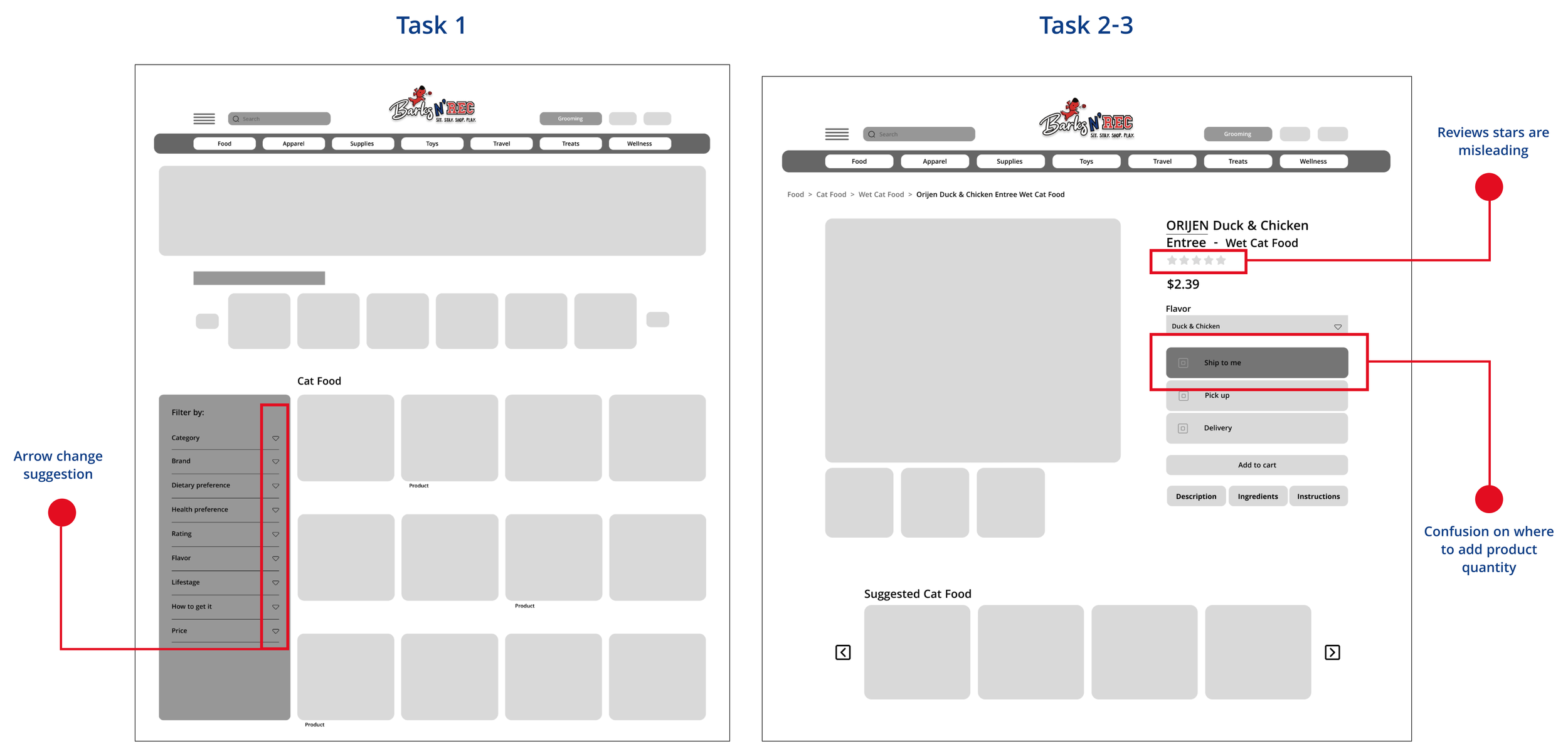
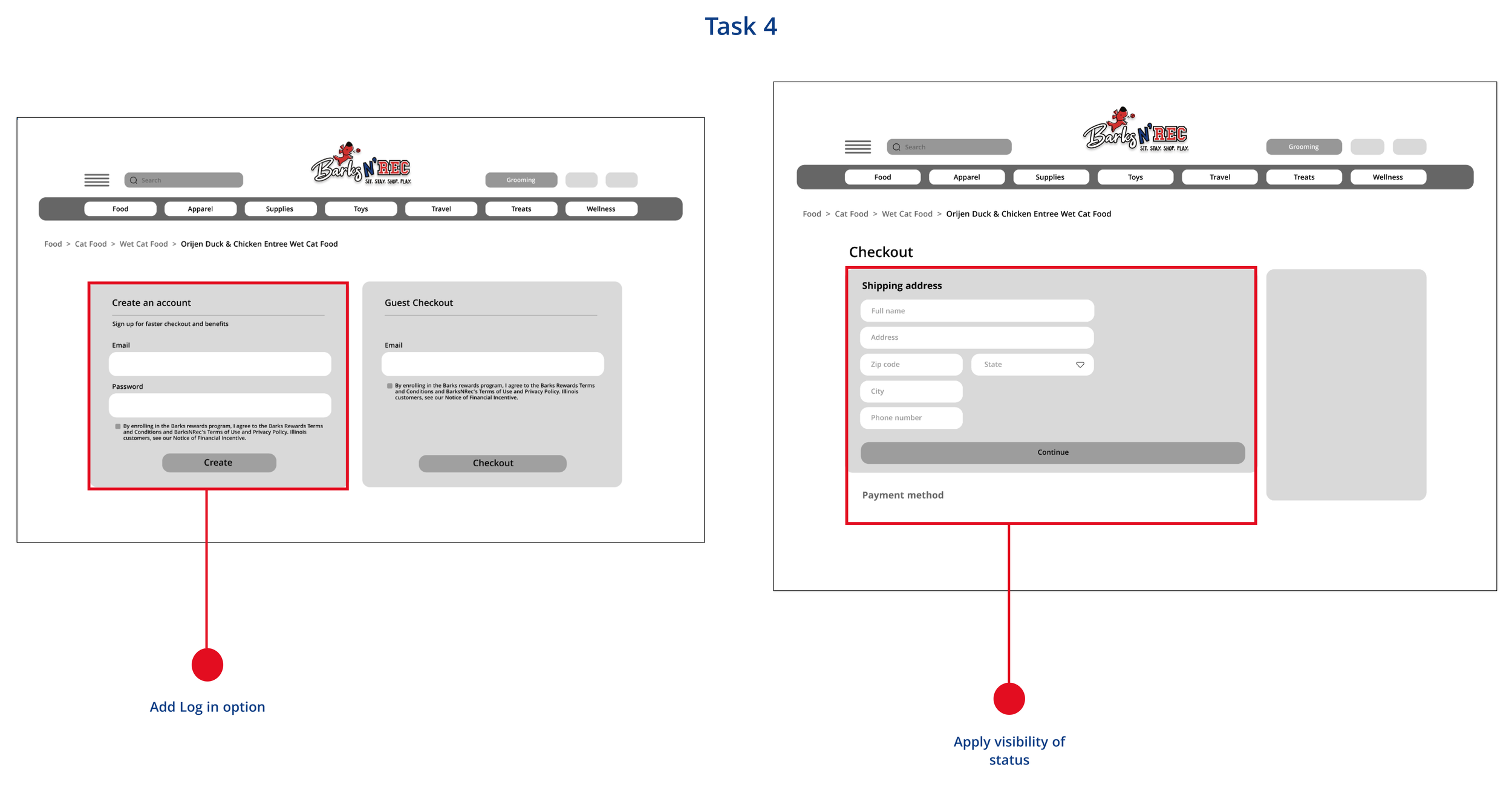
Lets fast forward a little. At this point I have created all my initial wireframes and prototype it. I feel good about it, but as we know, is not about me, it’s all about what our users think, therefore I took the time to conduct a Usability Test that consisted of 4 user (pet lovers and shoppers) to see were they find confusions and hesitations, and ultimately grab their brain once again on how I can make this even better. The results were in, and as expected we found room for improvement and Im all ears.
Below see the task in relation with the completion rate and user hesitations.
Time for the final prototype! Taking in consideration all our users feedback and adding fidelity taking in consideration all UI principles, I deliver a enjoyable and on brand experience.
I hope you like it! If you have any questions, feel free to reach out and I will be happy to answer.
The next phases and features of this platform that we aim to develop are the following:
In order to facilitate and make our users life easier, we would like to develop a set of recurring order system that will align with both user and business goals.
We would like to integrate social media to the shopping experience and see how social media can support and make our users feel they can trust the products our client offers.


